Digital Reinterpretations of Blackletter
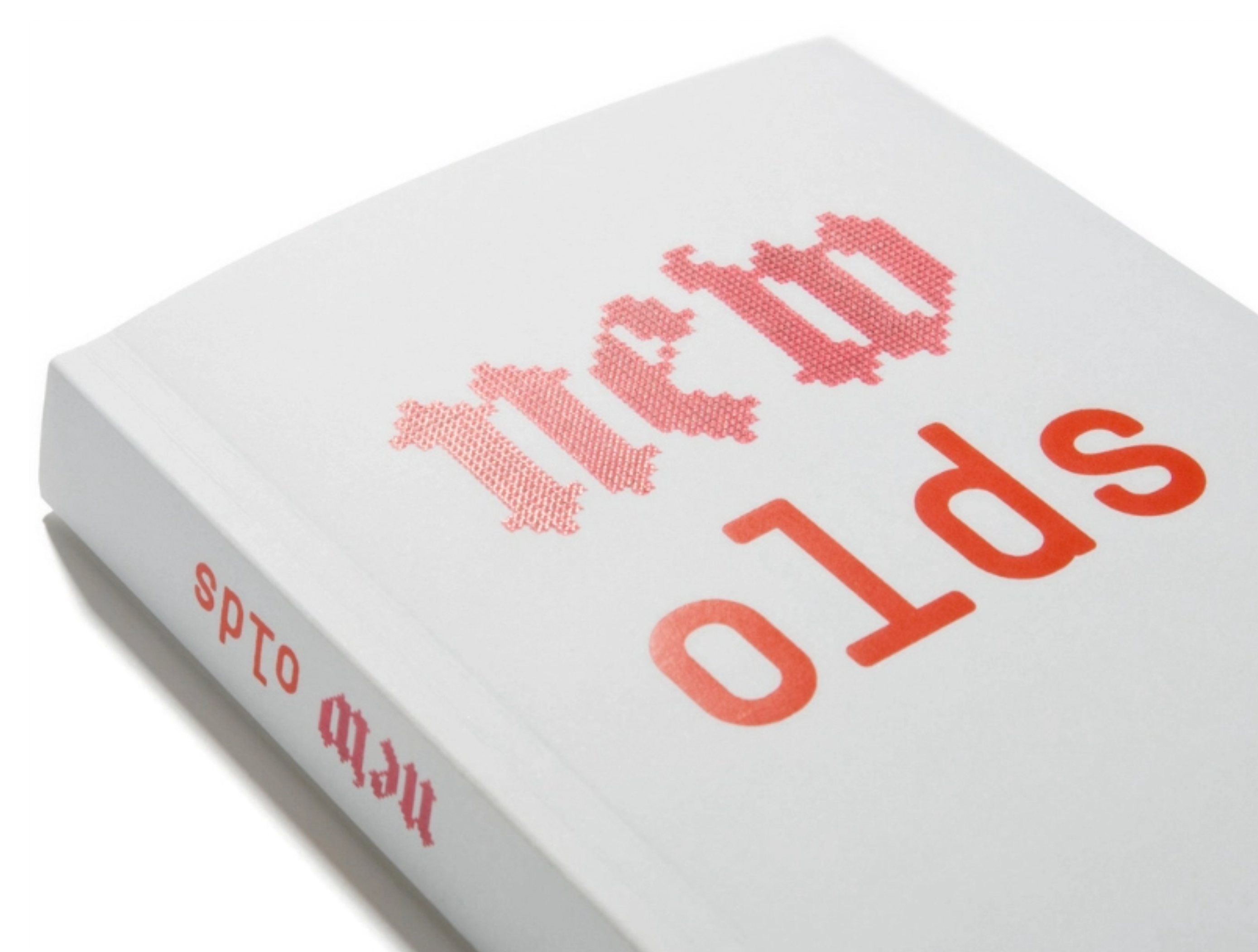
Blackletter has a strong association with tradition and history. In the Institute for Foreign Cultural Relation’s the exhibition new olds it examines “design in the tension between tradition and innovation” Heine/Lenz/Zizka designed a bilingual catalog that accompanies the exhibition on its tour around the world. For the oxymoronic title, an embroidered looking blackletter has been contrasted with a monolinear monospace. The former is Pixtur, designed in 2005 by Anja Gollor and Henry Hajdu as a pixel version of Fette Haenel-Fraktur. Three styles – Dots, Quads and an unnamed Solid – were included on the CD that came with Fraktur Mon Amour. The latter is LL Simple, designed four years earlier by Norm.
“Marian black is a digital reinterpretation of blackletter that reduces the thicks of the letterform to a single-weight stroke.”
Pixtur takes advantage of the associations of blackletter type and combines it with a mode of mark making that directly references the digital. Pixtur Regular (Solid) mimics the pixelation of type that we often encounter in low resolution screens while Pixtur Quads is made up of small rectangles that reference the pixels on a digital interface.

