A Return to Ornament
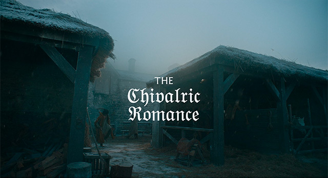
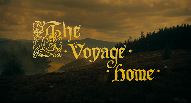
A characteristic of blackletter type is their elaborate strokes that extrude from their main form. Combined with its aesthetic that has now become very stylized, blackletter is seeing a return to use as a display font across media today. We can see this happening in the recently released Lowery film The Green Knight: an epic fantasy adventure based on the timeless Arthurian legend.
“A characteristic of blackletter type is their elaborate strokes that extrude from their main form.”
The use of blackletter makes sense in context of a film that is based in Medieval times. The title cards in The Green Knight are all set in blackletter and highlight the beautiful ornamentation on blackletter type. Compared to the influx of movies that automatically resort to an easily readable type for their title cards, the blackletter used in The Green Knight is a breath of fresh air and makes you appreciate the formal qualities of the type that much more.
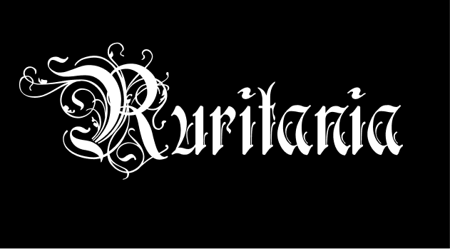
Fonts like Ruritania go overboard with ornamentation to the point where the strokes extruding from the type starts to reduce legibility. While fonts like Ruritania may not be practical in many instances, it serves its specific niche for anyone looking to break from the sterile mold of typography today.
“Sir Gawain and the Green Knight is a late 14th-century chivalric romance in Middle English.”