A Brief History of Blackletter
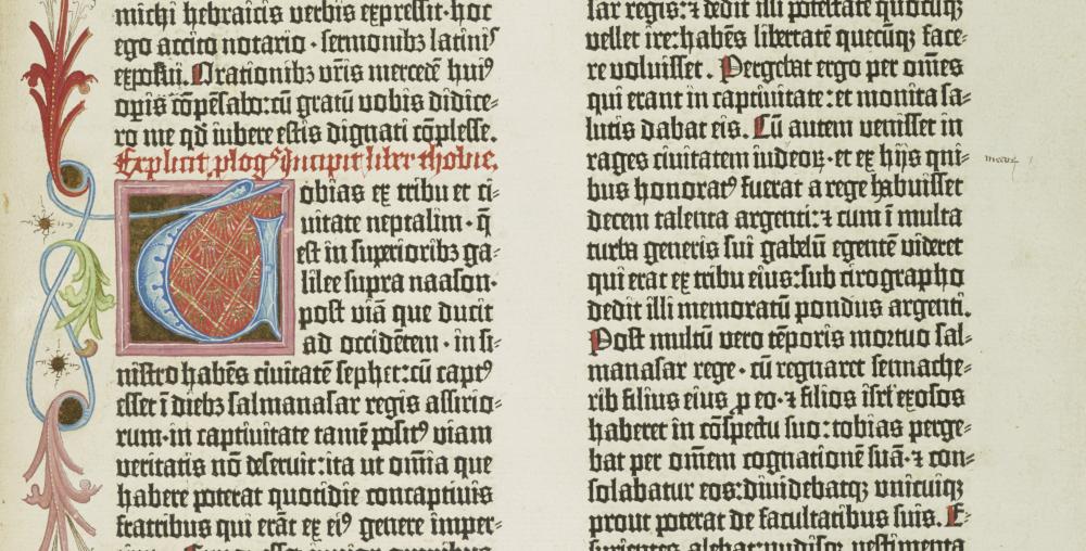
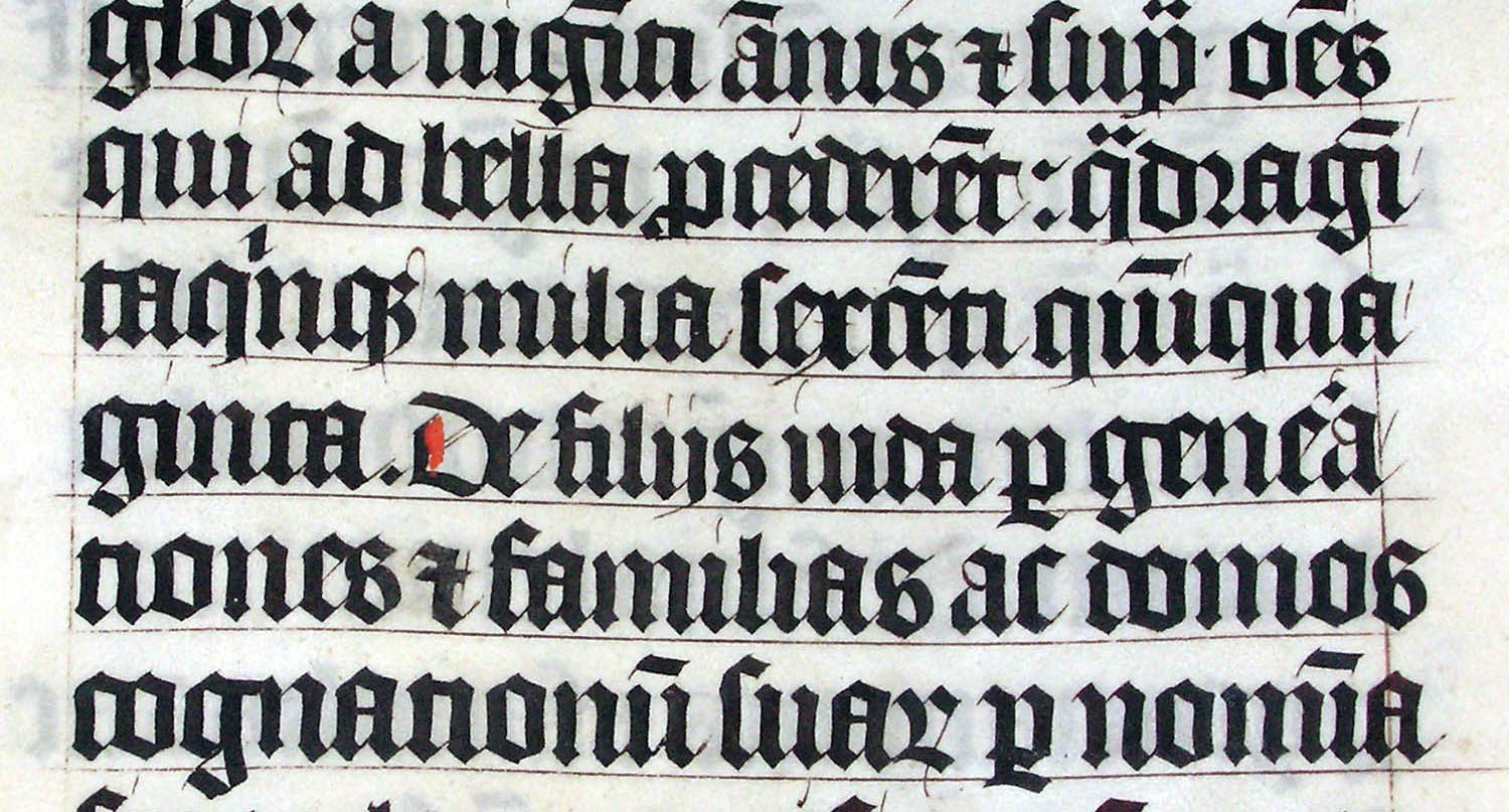
The Blackletter typeface (also sometimes referred to as Gothic, Fraktur or Old English) was used in the Gutenburg Bible, one of the first books printed in Europe. This style of typeface is recognizable by its dramatic thin and thick strokes, and in some fonts, the elaborate swirls on the serifs. Blackletter typefaces were based on early manuscript lettering and its form reflected the movement of the writing hand.
“This style of typeface is recognizable by its dramatic thin and thick strokes.”
While Gutenberg used blackletters for his bible and books, blackletter was difficult to read as body text. Additionally, Roman and Italic faces were easier to print with movable type. For these reasons, in the 1500’s, blackletter became less popular for printing in many countries except Germany and German speaking countries.
Germany continued to use blackletters until the early twentieth century. In the 1920’s it was considered to be antiquated by German designers and publishers and fell out of favor and was replaced by the “New Typography” of sans serif typefaces. In 1933 Hitler declared the new typography to be un-German and declared Fraktur to be “Volk”, i.e. the people’s font. The Nazis continued to use Fraktur extensively until 1941 when it was replace with more readable fonts. Some people associate all blackletters as Nazi fonts but this view of blackletter wipes out several hundred years of the typefaces’ history.

